There’s been some awful shirts over the years, and it’s time to dive into the world of non-league to expose some more. I don’t get how kit manufacturers look at certain kits and give them the go ahead, they must be employing Stevie Wonder!
Let’s get going…
Torquay United
We’re kicking off with a kit I was forced to put in this list by the other Semi-Pro lads so I am getting this one out the way as I frankly don’t see anything wrong with it.
Torquay United got fans to vote on their away kit for next season, a selection which was compiled with four unique designs.
Gone are the days of boring black and white strips, Torquay have introduced a quality design which for some reason the rest of the Semi-Pro boys are slating.
Semi-Pro’s Charlie said: “It literally looks like it could be on the sale rail in Hollister, how did this get a sign off? Torquay may be on the English Rivera but it’s not exactly the Bahamas, can see plenty of jokes being made come a wet rainy away days at the likes of Chesham, Dorking and Tonbridge.”
Newcraigball Leith Victoria
Now, here is one I can’t get behind. This has to be a joke. To think that 11 men are running around a football pitch looking like that… awful.
I’m all here for a bit of a laugh but this is ridiculous. They’ve gone too far to look like a genuine beer bottle.
A quality outfit if you were going to the darts, but not if you’re looking to push for promotion.
Semi-Pro’s Zak said: ”If they actually had to wear that, I feel sorry for them. There’s too much head on the pint too. However, if it is a special edition kit, I’ll let them off.”
Bromley
You may look at the video above and not find anything wrong with the white Bromley strip that features in the beginning of the video.
However, just wait until they showcase the away kit. You’ll know it when you see it.
It looks like something you would turn up to for a year 6 disco. To think Bromley players had to play in that this season. Surely no fans spent money to buy that right?
Semi-Pro’s James said: “That is horror. If they changed the pink to black I think it has the prospect to be a decent kit but at the moment, it’s absolutely shambolic.”
Enfield Town
I struggled to find a tweet that advertised this horrific kit, and I am not surprised one bit. The colours red and yellow have no right to be the primary colours on a shirt.
But it isn’t just the colours that are wrong with this. The massive square sponsor that sits in the middle just tops this disaster class off.
Some have dubbed this as the ‘blood and custard’ kit, a description that is spot on.
Semi-Pro’s Ollie said: “It’s bad. It just hurts so much. Sponsors never do favours on kits but this one is shocking. Literally a high-vis rhubarb and custard.”
Potters Bar Town
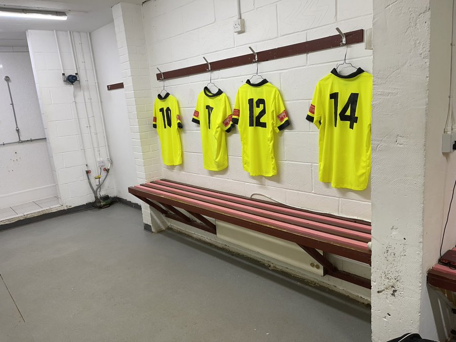
It wouldn’t be a Semi-Pro article without a Potters Bar Town mention. It was Semi-Pro’s Owen who put forward the idea of this kit, a shirt the players hated playing in.
If the Enfield kit was called high-vis, then I don’t know what we call this? A glow in the dark mess would fit.
The only benefit that comes with this kit is that an evening game could probably be played without the floodlights.
Maybe their media man could take on a joint role and become the kit designer too. I’ll have a word with him.
Owen said: “I was a big fan but the players hated it. Valckx Fernandes described the shirt as ‘bookey’ once.”
Read more below:
FA Vase Trophy Final 2021: Warrington Rylands vs Binfield
By James Hamilton
An Unlikely Domination
By Josh Brewer

